Kamil Rosikiewicz
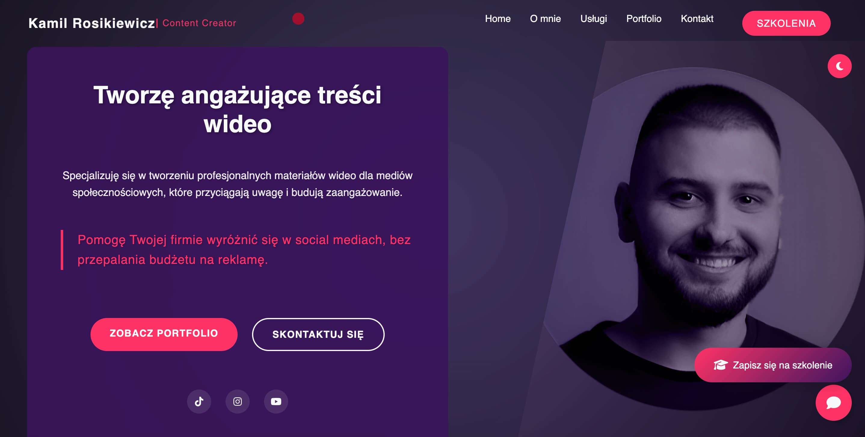
Kamil Rosikiewicz needed a website that proves quality through imagery yet still opens fast on a phone. We built a site where the portfolio plays like a showreel and every page leads the visitor down a clear path — to an enquiry, or to a place on a training course.
- Client
- Kamil Rosikiewicz, a video content creator
- Services
- Websites
Project context
A video creator faces one fundamental problem with their website: it has to prove quality through imagery, yet it cannot afford a page that takes ten seconds to load. We built a site that reconciles both demands. The portfolio plays like a showreel, and the page opens fast on a phone and a weak connection too.
Visual impact alone was not the goal, though. The client sells companies a specific promise — video content that makes them stand out on social media — and runs training courses alongside it. So the site had to serve two goals at once: bring in enquiries and training signups, not just compliments.
We ran the whole project in direct contact with the client — from defining the structure and how the work should be presented, through implementation, to launch and the SEO foundations. No intermediaries, so nothing got lost in handovers.
Business challenge
The core tension in this project was media versus performance. Video and large frames are the product here, so they could not simply be stripped down — and at the same time a slow page drives visitors away and hurts search rankings. The media layer had to be engineered, not just styled.
The second challenge was structure. A good-looking page does not generate enquiries by itself: a visitor has to grasp within seconds what the creator does, see proof of quality, and know what the next step is. On top of that, two different paths — commissioning work and joining a course — had to be present at once without competing for attention.
Scope of delivery
The delivery covered the information architecture, the layout and hierarchy agreed together with the client, the front-end implementation, the engineering of the media layer, the SEO foundations and the production launch.
Decisions were made on working versions of the site that could be clicked through and commented on, rather than on mockups and slide decks. A remark from the client went straight into the site, with no stage in between where a design has to be translated into code.
Founder's role
Designed and built by the firm's founder, Jakub Zając, working directly with the client — information architecture, implementation, media optimisation, SEO and launch.
Capabilities involved
- Product and technical analysis
- Turning a wish list into a scope that can be priced and built.
- Frontend engineering
- Applications that stay fast and accessible on a poor connection too.
- Cloud and DevOps
- Repeatable deployments and environments you can rebuild.
The disciplines this delivery required — a list of disciplines, not of job titles.
Solution
A structure built for enquiries
We designed the page hierarchy around a single path: a strong opening that states the promise to companies outright, a clear presentation of services, proof of quality, and a distinct call to contact. Every page has a defined next step, so a visitor never hits a dead end.
Presenting the video work
The portfolio is built on carefully chosen stills rather than dozens of embedded players. Video loads only when the user explicitly asks for it — browsing the work stays smooth, and the page does not carry the weight of every player at once on first load.
Performance despite heavy media
Images go up in modern formats (AVIF/WebP) and in several sizes, and the browser picks the one that matches the screen. The rest loads only as it comes near the viewport. The content itself is plain static HTML, so the first view never waits on a backend.
Responsive design and a consistent personal brand
The site was built mobile-first, because a large share of a video audience arrives on a phone. Colours, typography and spacing live in CSS custom properties used across the whole stylesheet, so the identity is identical on the homepage, in the portfolio and in the footer — and the site carries both a light and a dark theme.
SEO foundations and handover
The site has correct semantic structure, metadata for search engines and social sharing, and a sitemap. There is no WordPress behind it and no CMS of any kind — it is hand-written HTML, CSS and JavaScript, so content changes are made in the code and published again. At this size the trade pays off: a simpler stack, no admin panel, no database, a lower cost of ownership and quick loading. There is a cost and we name it: without a self-service editor, the client cannot fix a paragraph from a browser. After launch we handed over the full set of access credentials — the code and the accounts belong to the client.
Technology stack
Front end
- HTML
- CSS
- JavaScript
Media and performance
- AVIF/WebP
- Responsive images
- Lazy loading
SEO and sharing
- Semantic HTML
- Open Graph
- XML sitemap
Deployment
- Git
- Static hosting
Technical approach
- 01
Stills instead of embedded players: video loads on demand, not on page entry. That single decision determined the speed of the entire portfolio.
- 02
A static architecture: a marketing site this size needs neither an application server nor a CMS, so it has neither. Writing it by hand was not the cheap route, it was the right tool for the brief — fewer moving parts that can fail, and a smaller attack surface.
- 03
A clear hierarchy of actions: one primary action per section with at most one supporting it, plus a permanently available route to the training courses. A visitor never has to choose between five equal buttons.
- 04
Media prepared up front: stills exported and compressed to modern formats, at sizes that match the slots they actually fill. The browser never downloads a 4K frame to fill a thumbnail.
Quality and reliability
- All traffic runs over HTTPS, and the site sends a set of security headers that shut down the typical attack vectors against websites.
- The contact form is protected against spam in a way invisible to humans and collects only the data needed to answer an enquiry, following the principle of data minimisation.
- There is no CMS, no admin panel and no plugin ecosystem — which is how small sites usually get taken over. What is left to attack is static files and the server configuration.
Outcome
The client's online presence now matches the level of the work — the site itself acts as proof of quality before a visitor plays the first video.
The portfolio browses quickly on a phone as well, so heavy media no longer costs the visitors who arrive from social channels.
One site serves both paths: an enquiry from a company and a signup for a course. It needs no standing technical upkeep either — content changes go in through the code, and otherwise the site simply sits there and works.
Related services
The scope this project drew on, described in more depth on the service pages.
Business websites, online stores and landing pages — fast, lightweight and built to turn visitors into enquiries.
More work
01Loyalty app and admin platform
IZAPzoo
IZAP, a brick-and-mortar retail chain, wanted its own loyalty programme on customers' phones instead of plastic cards. We designed and built the whole thing — Android and iOS apps, a cloud backend and an admin platform — and store staff now run points, rewards and promotions themselves.
Read the case study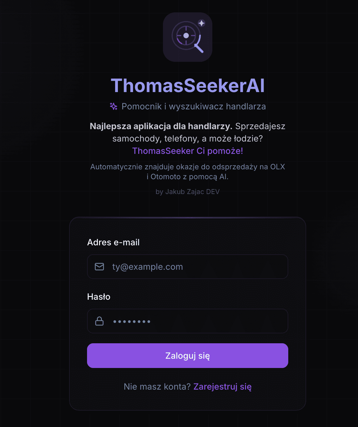
02Private opportunity-discovery tool with AI-assisted analysis
ThomasSeekerAI
A private trader was combing OLX, Otomoto, Allegro and a handful of smaller sites by hand, every day, for things worth reselling. We built an internal tool that takes that work over: searches described in a plain sentence run on a schedule in the background, the noise is filtered out, and what is left is ranked by how good the opportunity looks — hours of manual browsing turned into an automated job.
Read the case study
Let's talk about your project
Happy to walk you through how a similar approach would work in your case — and what we would avoid.